Covid Tracking
View COVID-19 Trends
Load libraries and Data
library(covid19.analytics)
library(data.table)
library(sqldf)
library(plotly)
library(openair)
## https://cran.r-project.org/web/packages/covid19.analytics/vignettes/covid19.analytics.html
##https://www.kaggle.com/modesty520/covid-19-detailed-visualization

iuh_colors <- c("#990000", "#EEEDEB","#01426A")
covid_data <- covid19.US.data()
## ~~~~~~~~~~~~~~~~~~~~~~~~~~~~~~~~~~~~~~~~~~~~~~~~~~~~~~~~~~~~~~~~~~~~~~~~~~~~~~~~
## --------------------------------------------------------------------------------
## ~~~~~~~~~~~~~~~~~~~~~~~~~~~~~~~~~~~~~~~~~~~~~~~~~~~~~~~~~~~~~~~~~~~~~~~~~~~~~~~~
## --------------------------------------------------------------------------------indiana <- subset(covid_data, Province_State == 'Indiana')
arkansas <- subset(covid_data, Province_State == 'Arkansas')
setDT(indiana)
indiana_long <- melt(indiana, id.var = c("Country_Region", "Province_State",
"Lat", "Long_"))
indiana_summary <- sqldf("select variable as date, sum(value) as cases
from indiana_long
group by variable")
setDT(indiana_summary)
indiana_summary[ , new := cases - shift(cases)]
in_plot <- plot_ly(indiana_summary, x = ~date, y = ~cases,
type = 'scatter',
mode = 'lines',
colors=iuh_colors,
hoverinfo='text',
text = ~paste('</br> Date: ', date,
'</br> Cases: ' , prettyNum(cases, big.mark=",",scientific=FALSE))
)
in_plot_new <- plot_ly(indiana_summary, x = ~date, y = ~new,
type = 'bar',
colors=iuh_colors,
hoverinfo='text',
text = ~paste('</br> Date: ', date,
'</br> Cases: ' , prettyNum(new, big.mark=",",scientific=FALSE),
'</br> Cumulative: ', prettyNum(cases, big.mark=",",scientific=FALSE))
)Cumulative Cases:
This is helpful to get a quick overview of cases over time. You can really see the growth taking off in October.
in_plot <- plot_ly(indiana_summary, x = ~date, y = ~cases,
                   type = 'scatter',
                   mode = 'lines',
                   fill='tozeroy',
                   hoverinfo='text',
                   line = list(color=iuh_colors[1]),
                   fillcolor = list(color=iuh_colors[1]),
                   text = ~paste('</br> Date: ', date,
                                 '</br> Cases: ' , prettyNum(cases, big.mark=",",scientific=FALSE))
) %>% layout(title = 'Cumulative Covid Cases (Indiana)', xaxis=list(autotick=F, dtick=30))

in_plot
New Cases
In this plot, you can also see the growth. In addition, you can see as the new cases start to reach the peak and slowly start decreasing.
in_plot_new <- plot_ly(indiana_summary, x = ~date, y = ~new,
type = 'bar',
marker = list(color=iuh_colors[1]),
hoverinfo='text',
text = ~paste('</br> Date: ', date,
'</br> Cases: ' , prettyNum(new, big.mark=",",scientific=FALSE))
) %>% layout(title = 'New Covid Cases (Indiana)', xaxis=list(autotick=F, dtick=30))
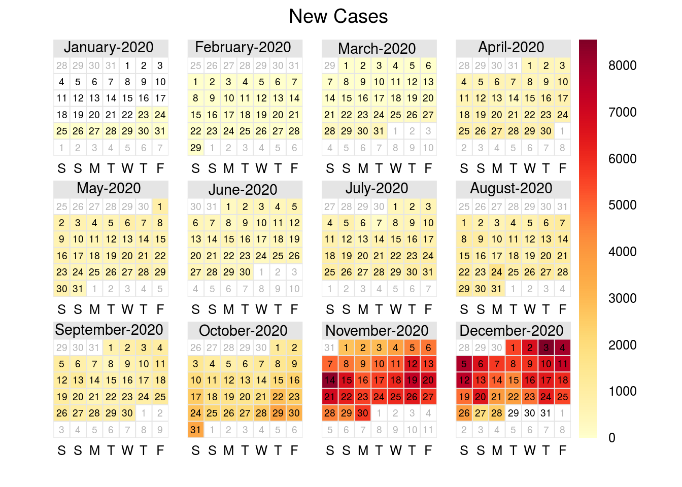
in_plot_newNew Cases - Calendar View
I find this view very intuitive. This really helps highlight how much higher the case counts were in the fall than the early peaks we saw in spring/summer.
date <- seq(from=as.Date(min(indiana_summary$date)),
            by=1,
            to = as.Date(max(indiana_summary$date)))


in_new <- indiana_summary[,"new"]
cal_plot <- calendarPlot(data.frame(in_new, date), pollutant = 'new', year = 2020, main = "New Cases")